1
PIKSEL
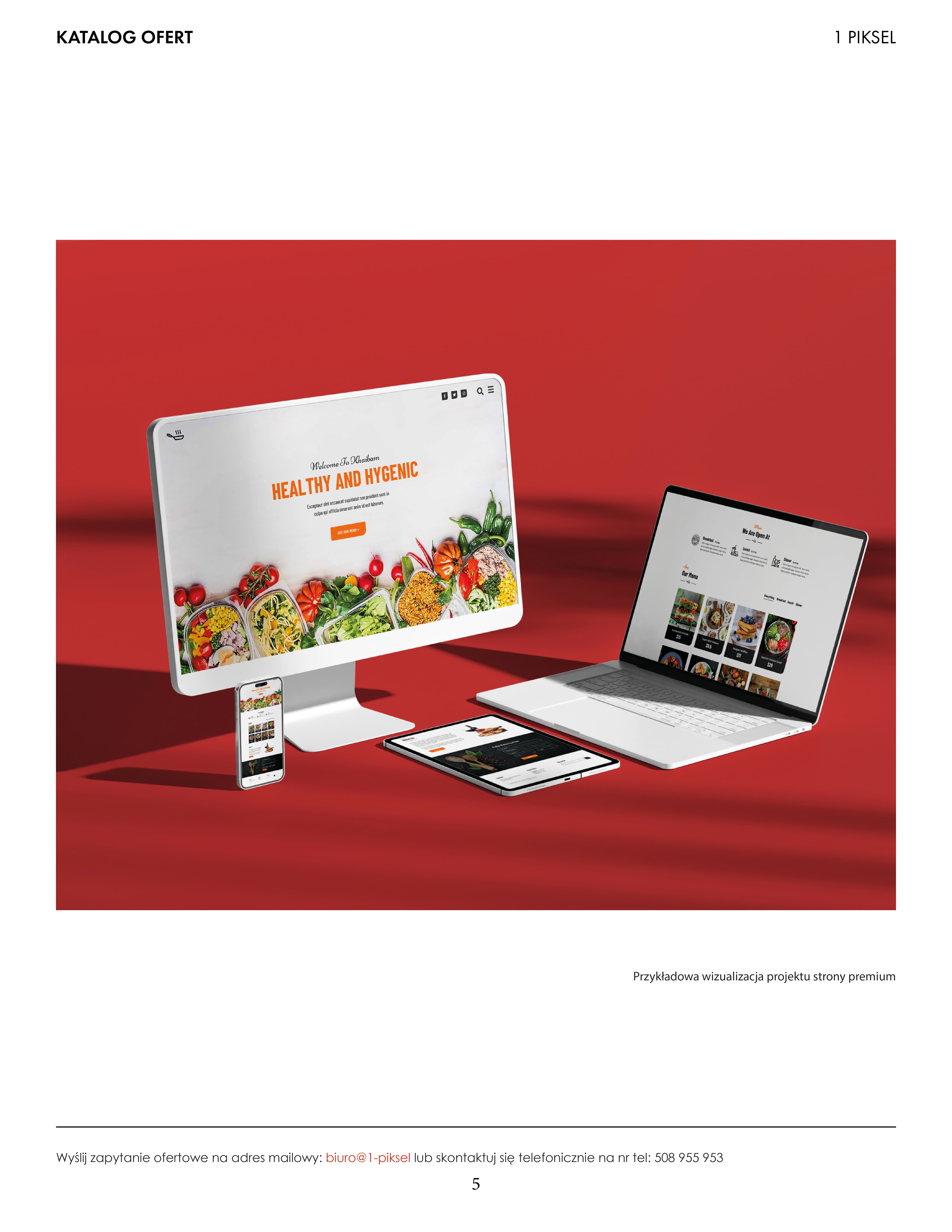
A comprehensive service catalogue for a graphic and advertising studio. From layout to print - a project that organizes the offering and builds the image of a professional brand.
Where it
came from
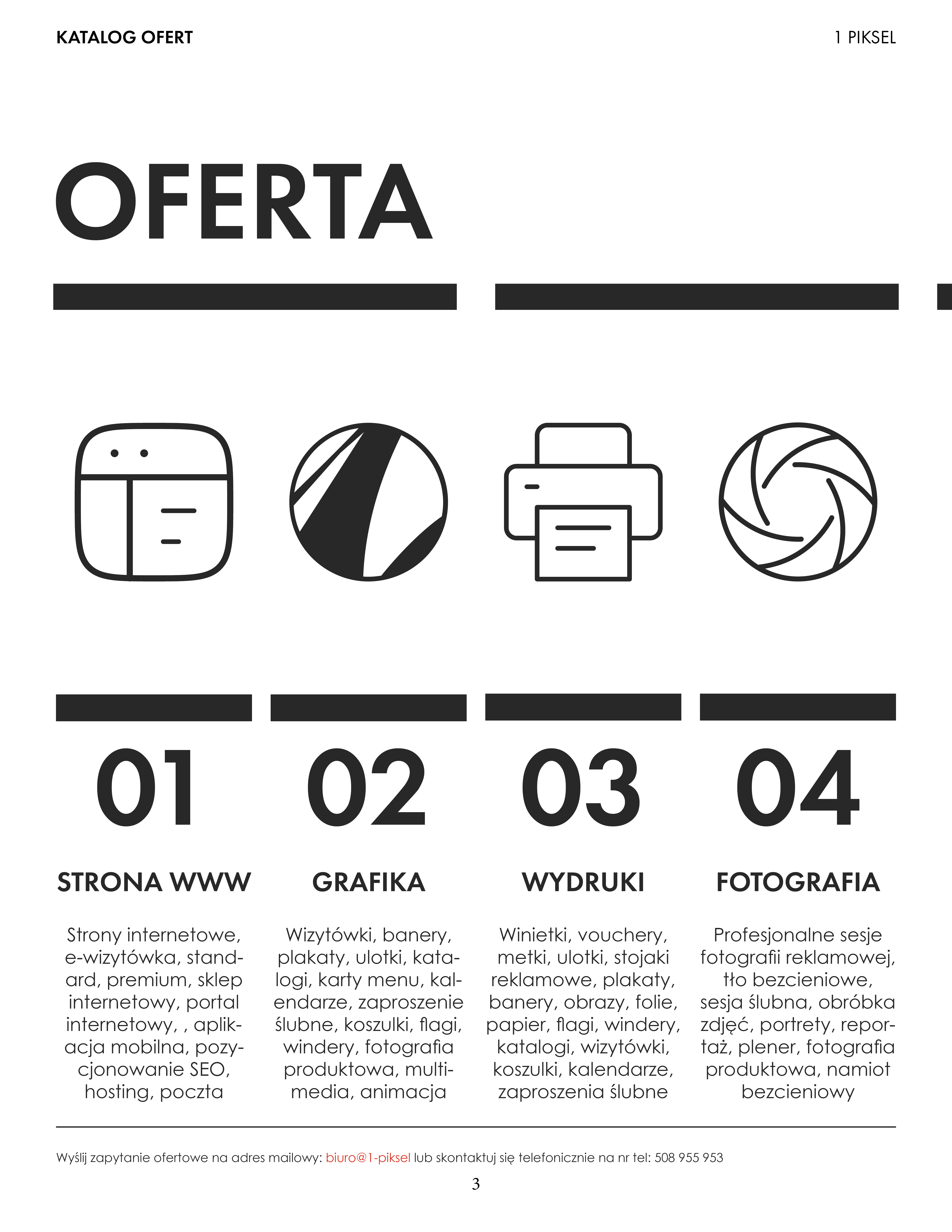
Studio 1 Piksel is a young, ambitious advertising agency. Their work is built on four pillars - websites, graphic design, advertising print, and business photography.
The task was to create a cohesive, printed service catalogue that would clearly present all offerings to potential clients. The document had to look professional while also standing out from the competition.
The key challenge: presenting four different service categories - each with their own process - in a single cohesive document, so clients would know exactly what to expect at every stage.
How the catalogue
is structured
The document's
language
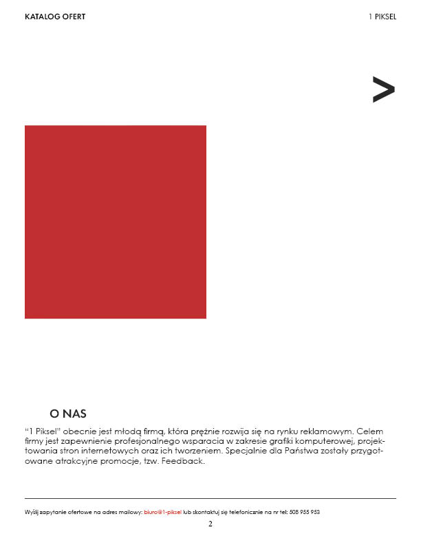
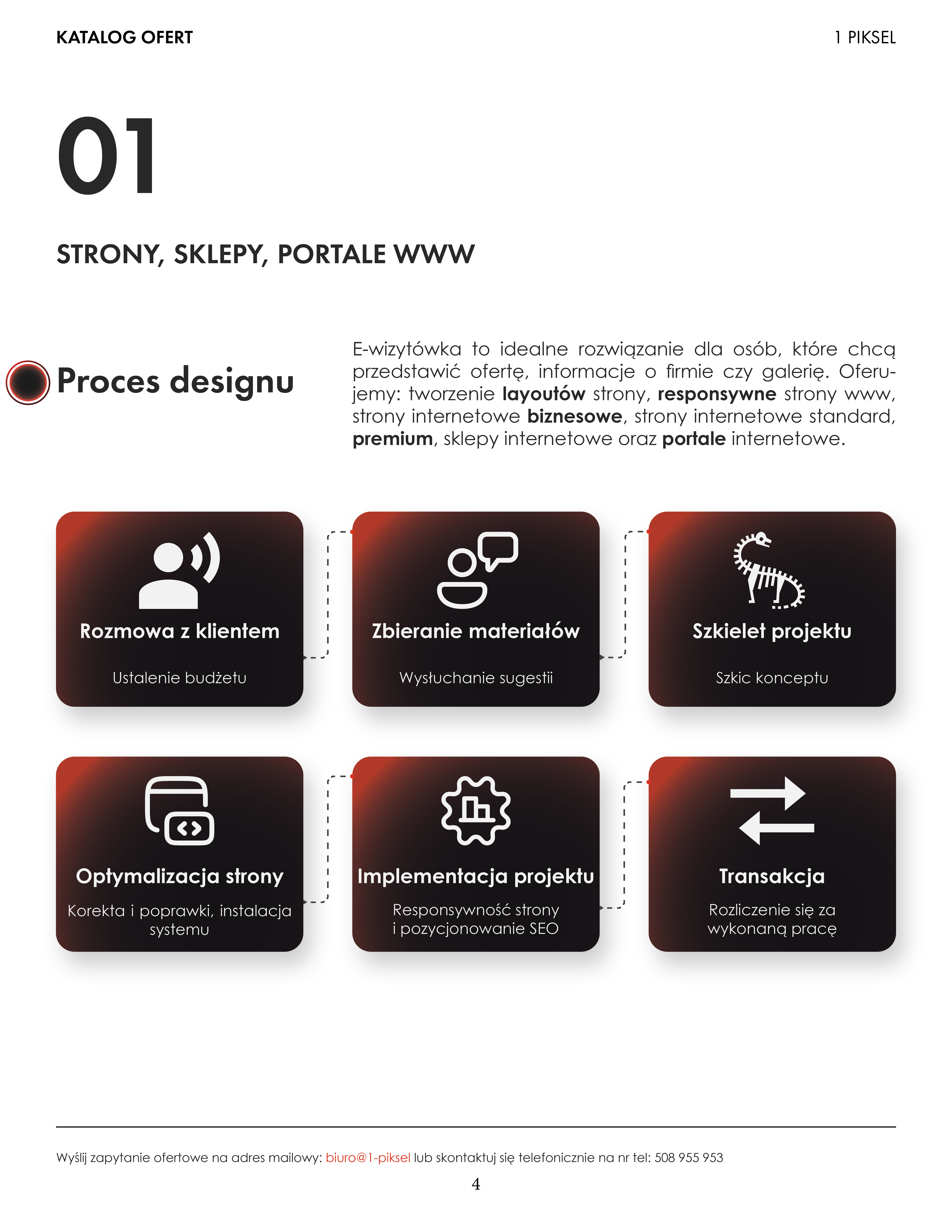
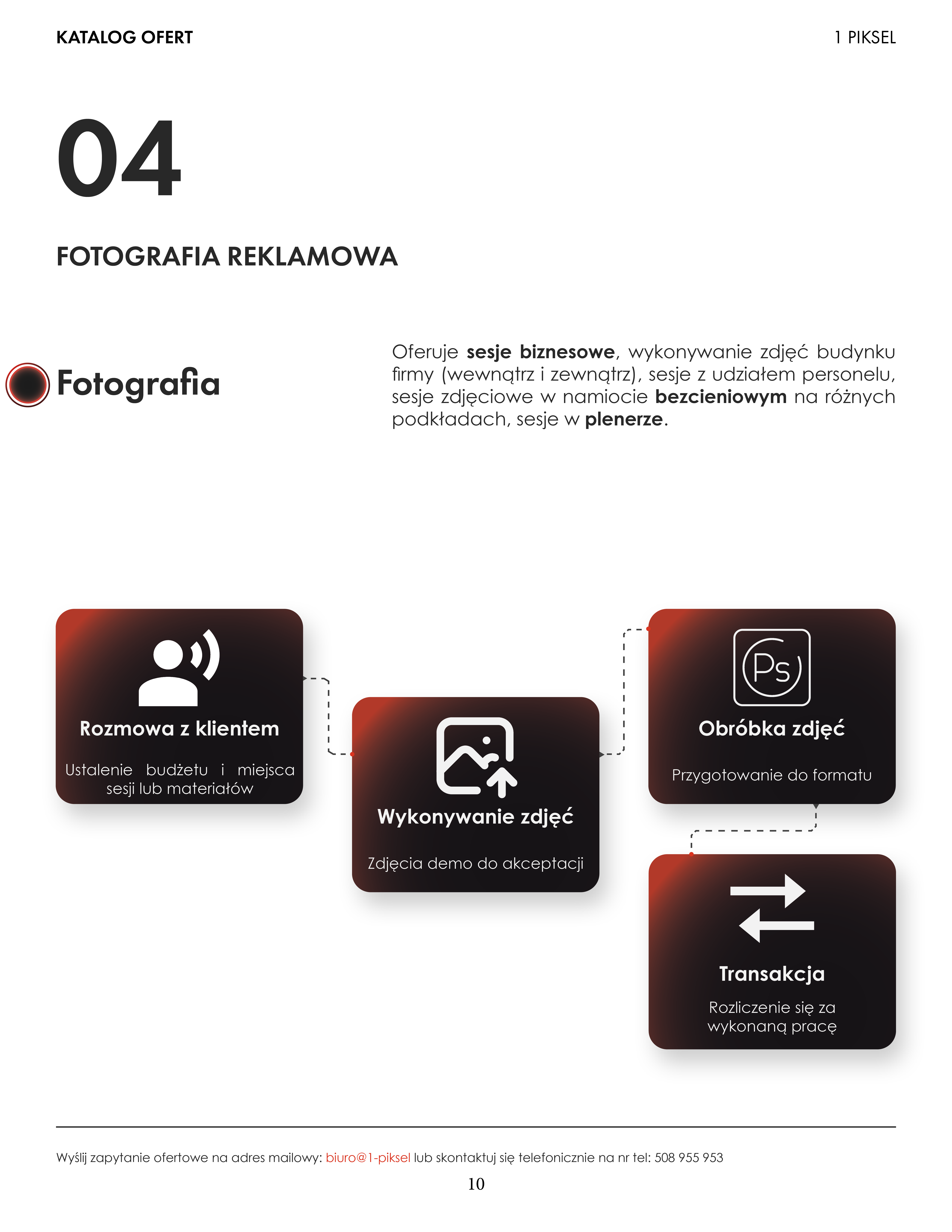
A minimalist black-and-white base with a deep red accent. The red appears in the gradients of the process cards - energetic but not aggressive. Against white, it creates a premium effect.
The contrast between bold black numbering (01, 02, 03...) and the delicate body text creates rhythm. Readability over decoration - a B2B catalogue must be functional.
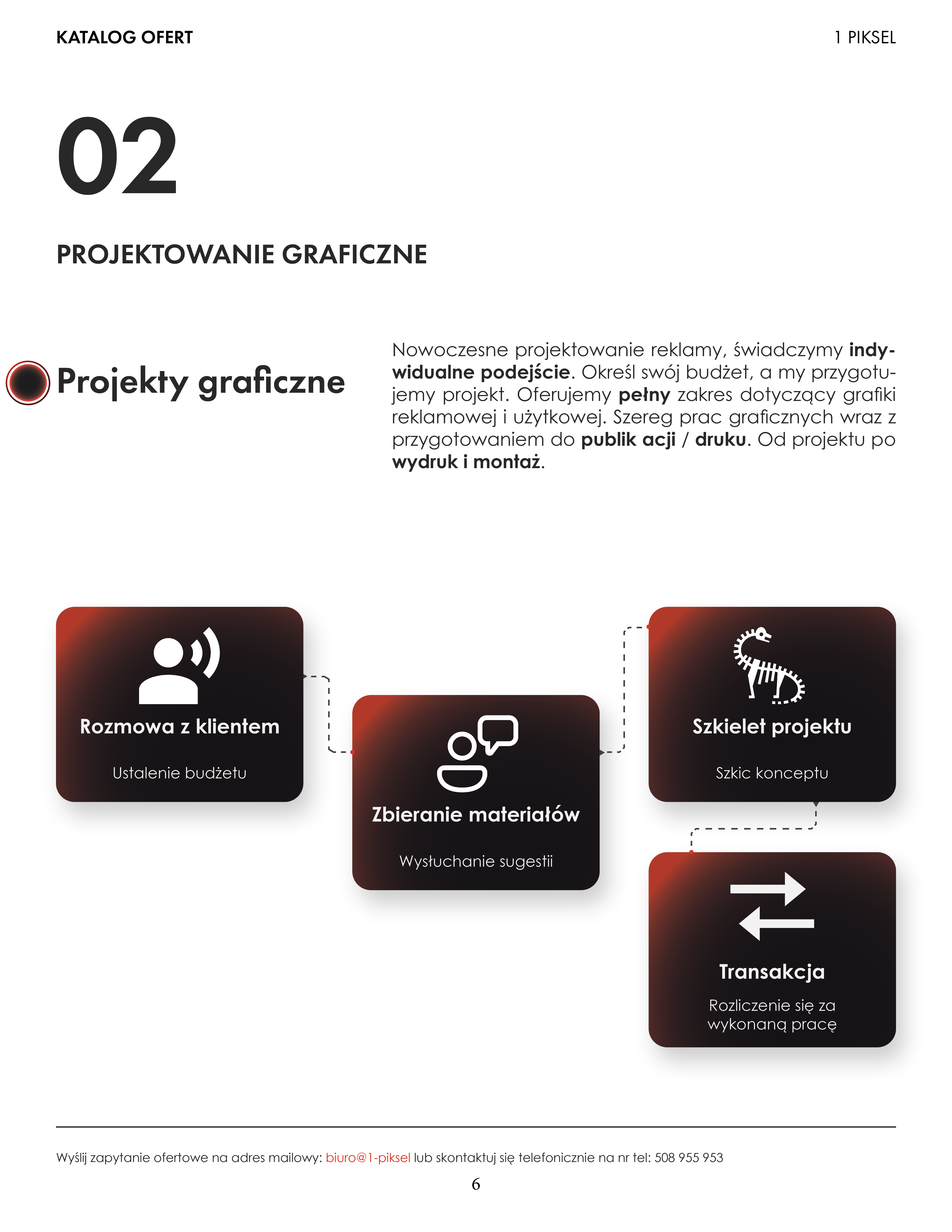
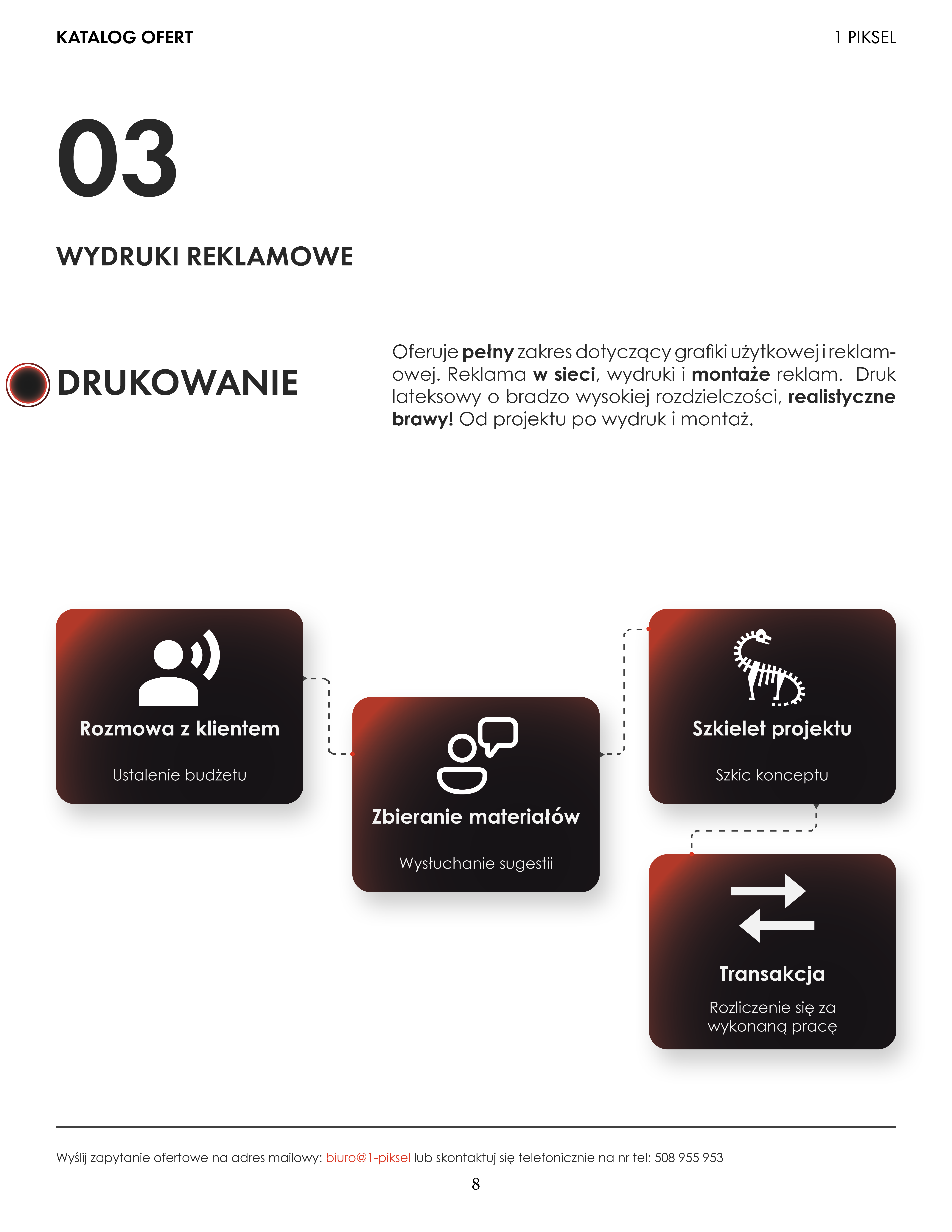
Each of the four services has its own process diagram. Cards with a black-to-red gradient and white icons form a cohesive, recognizable system element. When a client sees the diagram, they think: "I know exactly what I'm signing up for."
Four sections,
one cohesive document
What a well-designed
catalogue delivers
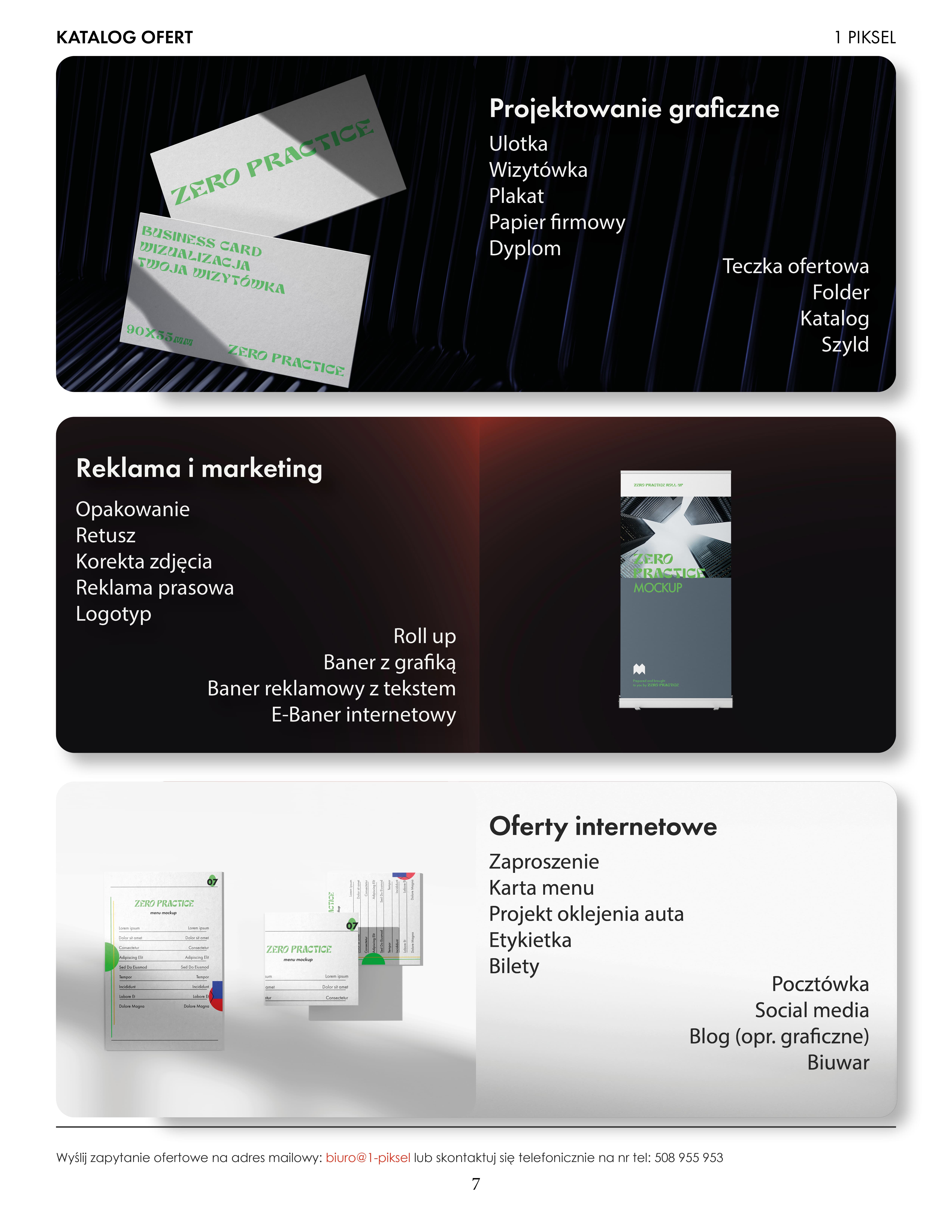
Hierarchy over decoration
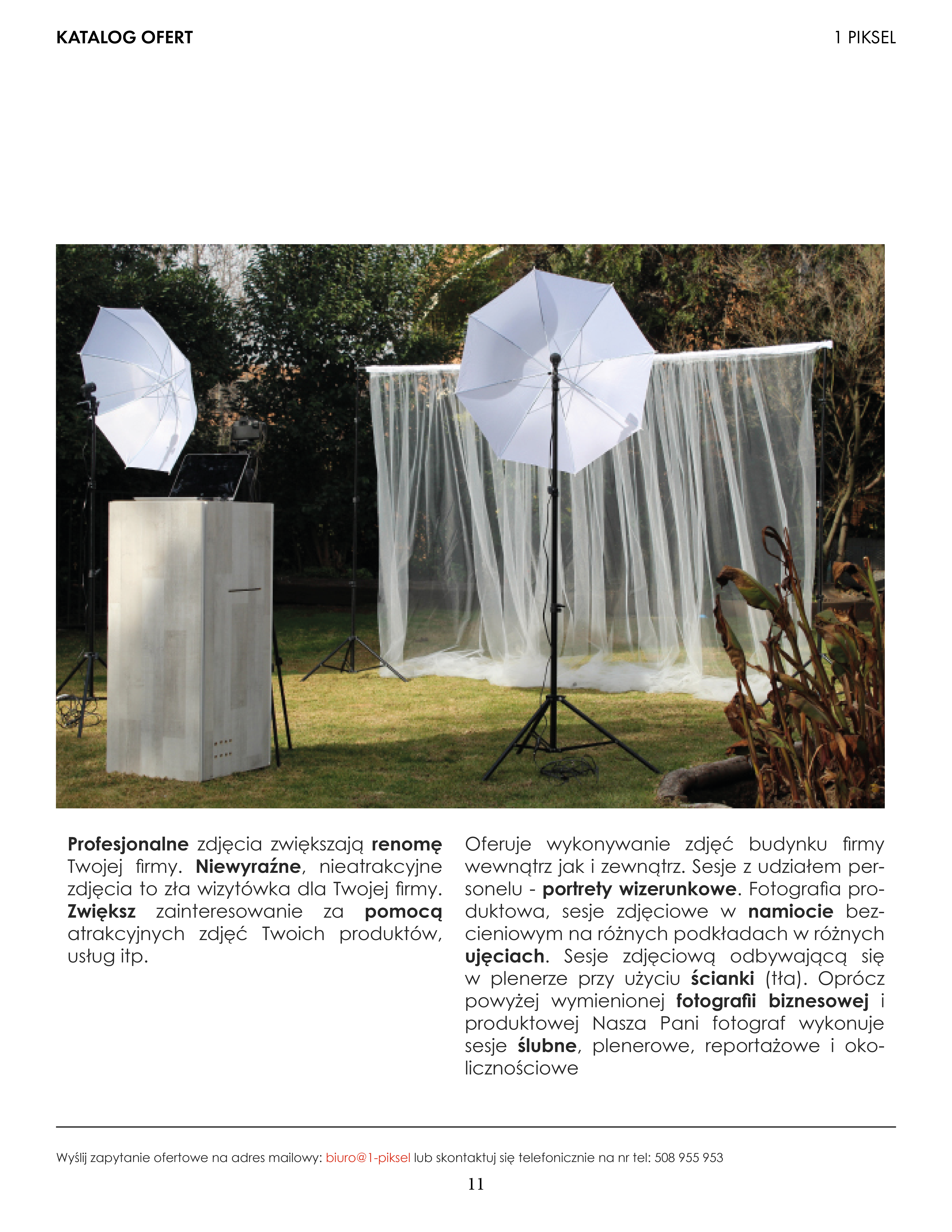
A B2B catalogue is a sales tool, not a portfolio. Typographic hierarchy - large section numbers, bold keywords, process diagrams - guides the client through the document before they have a chance to put it down.
Repetition builds a system
The same process layout appears in every section. Consistency is professionalism. The client understands the structure after the first page and never has to re-learn it.
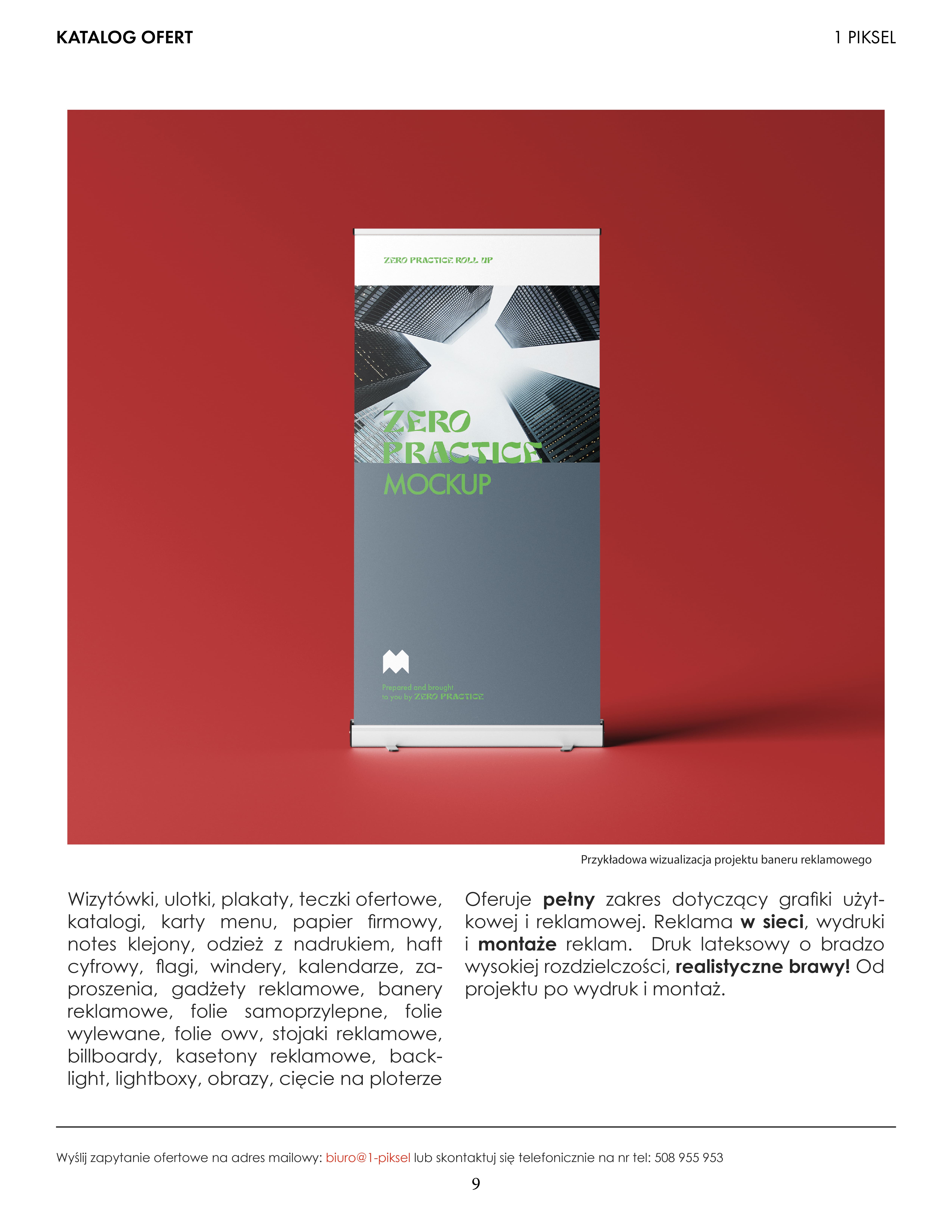
White space is an active element
White paper isn't background - it's breathing room. Wide margins and deliberate empty areas make the document feel more expensive and considered. Designed emptiness equals trust.